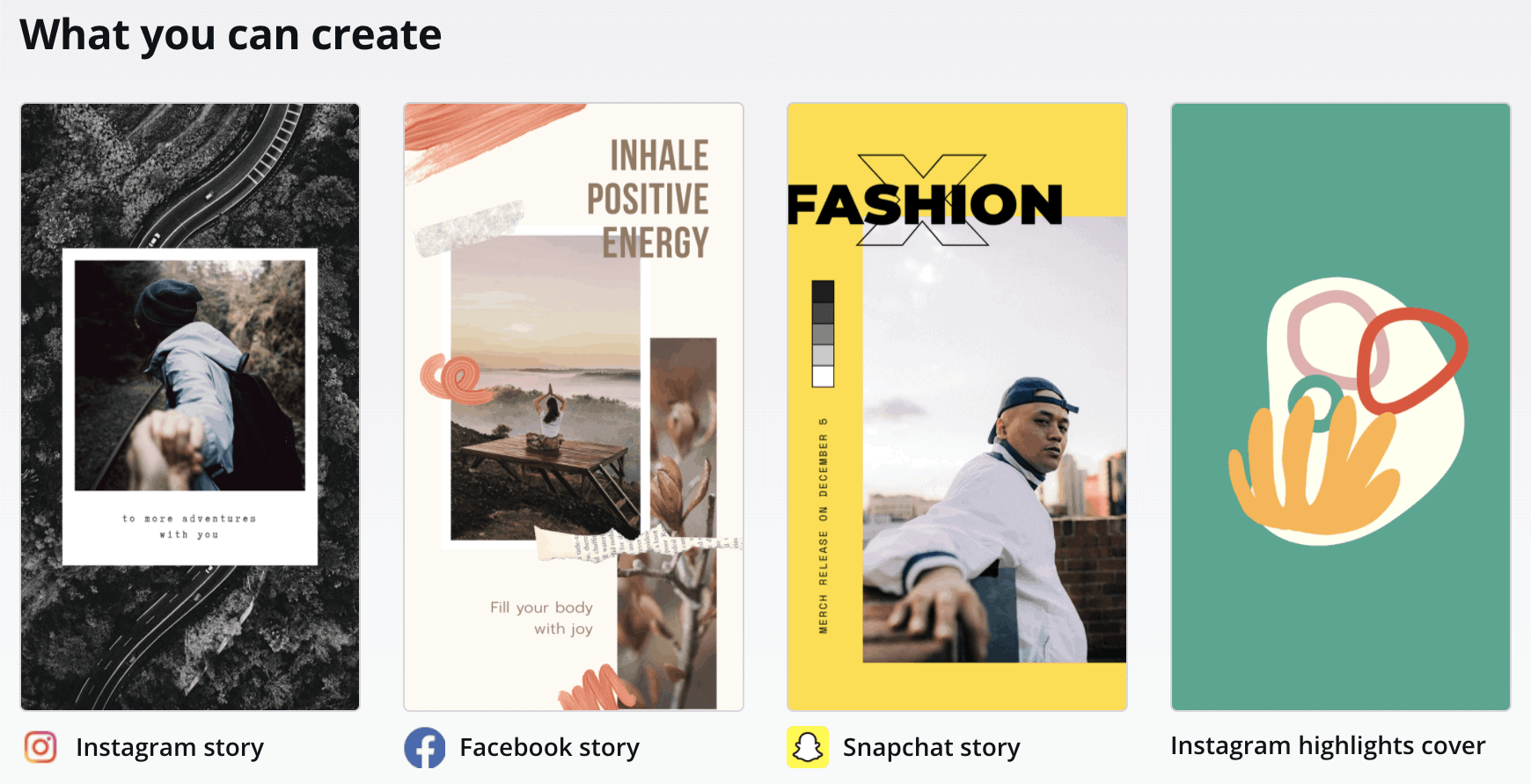
Instagram Templates 6
How to Create the Perfect Instagram Grid [11 Example Grid Layouts and Templates ]
Reading Time: 12 minutes
Instagram is a visual-first platform. Sounds boring, right? But sometimes you've to say basic stuff to drive home a point, which in this case is: you need to pay attention to your Instagram grid Layout even before you set up an account.
Have an account but a meh Instagram page? Chances are you aren't paying enough attention to your Instagram grid layout. Essentially, this is the order in which you post on Instagram. If you haven't been thinking the sequence through or aren't sure how to coordinate it for a visually engaging grid layout, we've got your back.
In this post, we'll look at:
- How to create a catchy grid layout on Instagram
- The different Instagram layouts you can try for yourself
- 11 examples of Instagram grid layout for your inspiration
- Instagram Grid Templates to Download
But, first, let's start with a quick recap.
Contents
- 1 What is an Instagram grid?
- 2 How to create the perfect Instagram grid layout for your brand?
- 2.1 Step 1: Work out your Instagram grid's theme
- 2.2 Step 2: Settle on your colors and font
- 2.3 Step 3: Revisit your content plan to revise the posts you'll need to create
- 2.4 Step 4: Pick a grid pattern
- 3 The 9 types of Instagram grid layouts you can choose from are:
- 3.1 i. Color coordination
- 3.2 ii. Rainbow feed
- 3.3 iii. Multiples of three
- 3.4 iv. Row-by-row
- 3.5 v. Instagram Tiles
- 3.6 vi. Line in the middle
- 3.7 vii. Borders
- 3.8 viii. Diagonal
- 3.9 ix. Squares
- 3.10 Step 5: Preview your grid
- 4 11 Instagram grid layout example
- 4.1 1. Rifle Paper Co
- 4.2 2. Project 7
- 4.3 3. Mindful Words Illustrator
- 4.4 4. WorkParty
- 4.5 5. The Mind Geek
- 4.6 6. Headspace
- 4.7 7. Shelby Mahurin
- 4.8 8. 8fact
- 4.9 9. The Language Nerd
- 4.10 10. Career Contessa
- 4.11 11. Kerby Rosanes
- 5 The emerging trend of Instagram grid layout design 2021 and beyond
- 5.1 Related
What is an Instagram grid?
Instagram shows your posts in rows of three visuals – be it video or photo. This row is called an account's grid. In simple words, your Instagram grid layout is the way you position your posts to create an engaging feed.
Now, you can go about posting whatever you like, in whatever sequence you prefer. However, to someone who visits your account, it would look all haphazard – no theme, zero color coordination, which leaves a poor impression of exactly what it is that you do.
Put together carefully and thoughtfully, your Instagram grid can communicate a story – giving profile visitors a reason to follow you. This is why you need an engaging Instagram grid layout so that it can leave a strong visual impression on your audience.
Source
How to create the perfect Instagram grid layout for your brand?
Creating a grid view takes some planning. But it wouldn't be hard if you follow along and do things in these steps.
Step 1: Work out your Instagram grid's theme
This is where you figure out the kind of aesthetic impression you want to leave on your visitors. This could be anything from a brightly, bubbly feed to a sober, strictly professional impression. Similarly, you can pick from playing with a dark, nude-shaded, or airy aesthetic.
Miro, for example, has a lively theme that follows their brand colors:

Source
For the sake of consistency, it's best you aim to leave the same impression with your Instagram feed as the one that your business website leaves. This way, you can put forward a uniform, well-defined, and consistent brand personality that's memorable and drives engagement.
If you're growing a small business or personal brand and haven't invested much in your website, it's a good idea to sit down to decide the brand personality you want to share with your audience and stand out on Instagram.
Ask yourself:
- What aspects of my personality or business personality do I want to share with my target audience?
- Which visual theme would best communicate my brand personality?
Answering these questions now is essential for finding the direction you want to take. In the long haul, you can return to these documented answers and follow the same notes for creating another social media account, your website, or any other visual asset.
So the work you put in now will help you stay on track and be consistent in communicating your brand personality. Win-win. 🙌
Pro tip : Sometimes creating consistency is just a filter or preset away. Meaning: apply the same filter to all your Instagram posts and you leave a consistent impression.
Take a look at Biteable's Instagram account. It uses the same brand colors that their Twitter and website does. And the aesthetics deliver their brand personality as bright and lively. In short, they live by creating cheerful, mood-lifting visuals that quickly catch attention.
Source
Step 2: Settle on your colors and font
Once you've finalized your account's theme, work on your brand colors and font. Again, this helps with consistency in your visual design. Plus, it reduces work on you as each time you sit to create your posts, edit graphics or pictures, you'll already have the info on which colors and font to use.
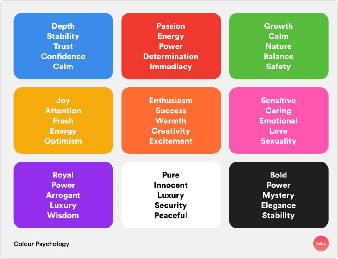
You don't need to spend very long on this step if you already have a documented visual brand identity. If not, take the time to settle on 2-3 colors that best describe your brand. Want a secret tip? Select colors based on psychology or the effect they leave on your audience.
So instead of shortlisting your favorite colors, identify the impression you want to leave on your audience. Then, pick a color that can help you do so. For instance:
- The color orange is for enthusiasm, creativity, and enthusiasm
- Blue is a calm color that symbolizes trust. Red showcases passion and adventure
- And, yellow is for positivity, happiness, energy, and creativity
Source
If you're a personal brand though, you can absolutely include a favorite color or a color that captures your personality.
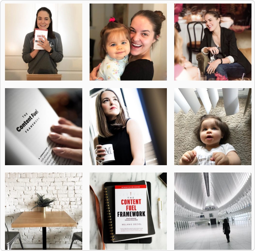
Take Motivational Speaker and Author, Melanie Deziel, for example. Her colors are white, black, and red. And, her IG grid reflects those in almost every picture she shares.
Source
Step 3: Revisit your content plan to revise the posts you'll need to create
The content that you intend to share on Instagram plays a significant role in the type of posts you'll add to your grid.
For instance, you can choose from posting human faces (as Melanie does), quotes, sticky notes, tweets, or graphics that share industry tips. However, posting the shortlisted content types without any pre-determined pattern ruins the look you want to achieve with your Instagram grid layout.
The solution? Decide on a posting frequency. Say you want to post lots of tweets. In that case, you can settle on posting tweet-based pictures after two other graphics or any other content type. This way, the tweets you share will end up taking up the central position in the 3-block grid, giving you a uniform, visually engaging overall grid.
So a simple action steps to follow: decide on the type of content you'll share. Keep it to 2-3 types if you want to keep things simple yet engaging. Then, create an Instagram grid layout from the post types. Say, two brightly coloured graphics on either side with a quote at the center.
Or, like the Female Hustlers, play with two colors – basic but snazzy:
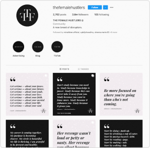
Source
Of course, you don't have to remain limited to this grid view alone. You can try a ton of other Instagram grid ideas – we'll share more of these in a bit. Simply be sure to visualize the photo grid pattern you choose to get an idea of how it'll look.
Step 4: Pick a grid pattern
Now, here's where you pick from various Instagram grid ideas. Keep in mind, some are a bit more challenging than others to execute. So decide realistically – factoring in the time you have up your sleeve and being honest about your aesthetic/design sense.
The 9 types of Instagram grid layouts you can choose from are:
i. Color coordination
For this grid view, work out color similarities or coordinate posts based on color. The aim is to have some color consistency in each type of post you share on your account.
The Female Hustlers example above followed this color scheme coordination layout. You can also take this a step further and transition from one color theme to another – a grid view layout that we'll discuss next.
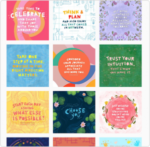
ii. Rainbow feed
Rainbow feed is when the colors in your grid change over time. This could be with each row of three posts, two rows, or three rows.
But, for this to work, you've got to have a good sense of color contrasts. Because shifting from one color scheme to another means the two colors bear some semblance to make the transition smooth.
Visme, a DIY design tool does this well, moving from shades of grey and yellow to orange and blue, for example:
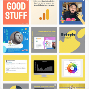
Source
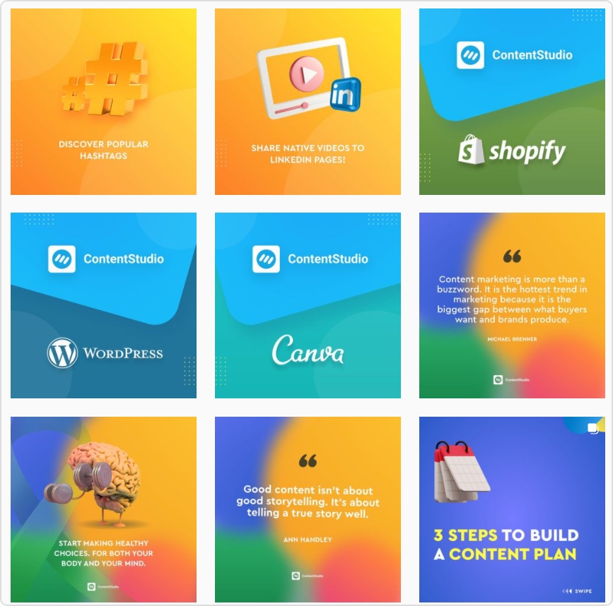
Pro tip : Split images across a number of six or nine titles. This creates a strong visual impact and is best for highlighting special announcements such as product launches.
iii. Multiples of three
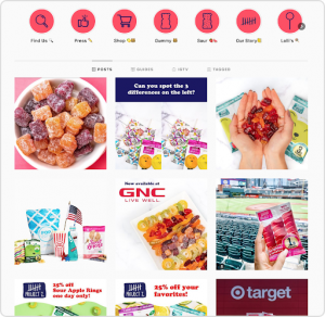
This Instagram grid view works with 3 tiles at a time – each sharing a similarity. For instance, share the visually related images that tell a visual story. If they don't tell a story, they should at least be visually related to each other one way or another.
Follow each grouping of three with another grouping that's either visually related or communicates a story. This will help you create a unique video grid for Instagram that's cohesive yet differentiated on the whole. 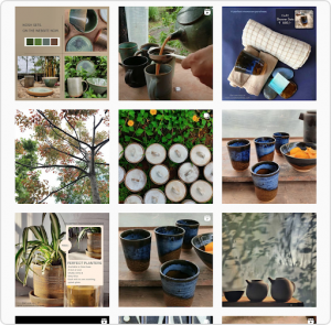
Source
However, be prepared: this type of grid template takes work. You have to ensure posts in a grouping are related but not similar so each stands out on its own while blending with the grouping's mini visual theme.
iv. Row-by-row
Like the grid view above, the row-by-row also tells a story. The idea is simple: post a row (three posts) sharing a theme, say quotes, followed by another row that shares another theme, for example, pictures. 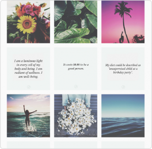
Source
This can make a very engaging Instagram grid layout – one that looks like a magazine. So, as a writer, I can use the row-by-row layout to share quotes in one row, followed by my desk's pictures in another, followed by quotes again, which are then followed by pictures of my book collection.
v. Instagram Tiles
Instagram tiles is a super simple and common Instagram grid layout template to follow. It involves sharing a photo followed by a quote on repeat – making for a classy Instagram grid view.
Source
You aren't limited to altering between photos and quotes though. Choose from any number of combinations that define your brand and are easy for you to make/curate.
For instance, you can post a drawing/illustration or a photo, an animation or a photo, or even an illustration and quote. Best to keep it human by adding your pictures, but that's not set in stone.
vi. Line in the middle
This is another easy way to create a welcoming Instagram photo grid. Simply reserve a single line in the center of each row. This way, when you put together all your posts, you'll get a consistent single line in the middle that comprises a content type – quotes, illustrations, tweets, or whatever you prefer.
Have more quotes to share than photos? Reserve the centerline in each row of three for a photo. Hence, your overall feed would have two lines of text on either side and one column of photos in the middle. You can also replace this photo grid template with a central column of illustrations or anything that you handcraft.
Source
vii. Borders
Border grid is another way to stand out on Instagram by helping create consistency. You can try plain white, square borders around each picture you post or go for borders on the sides. You can also get creative with a border grid layout, for instance, by using a circular border. 
Source
viii. Diagonal
If you're ready to put in some work, there's another Instagram photo grid that you'll like. This one arranges a set type of photo with a pre-selected color in a diagonal fashion. So what you'll need to do is:
- Select a color theme for the pictures/posts you'll add diagonally
- Select a phototype or central point of focus such as cat pictures
Now post them after three other pictures so they form a diagonal pattern when viewed. If you are ready to up the technical level a bit more, you can try the double diagonal Instagram grid layout. In that, select two different photo themes and colors. Then arrange each type to form a diagonal sequence in the grid. In this pattern, you can only have two random pictures that don't follow the diagonal pattern.
Furniture store, Koala executes this grid style best with a furniture item featured diagonally on their Instagram account:
Source
ix. Squares
This is the simplest of all the Instagram grid templates we've shared so far. You work post by post – no worries of pre-planning the entire grid beforehand. So what adds consistency here? Using the same filter or preset for each post. Alternatively, be sure to have the same colors in each post, as Lizzie Evans does, so that they look linked to each other.

Source
Step 5: Preview your grid
With this, we've answered the bulk of how to make an Instagram photo grid. The final step is to lay out your grid and preview it.
To this end, creating a mood board can help. A mood board is a visual collage or presentation and it helps you visualize your account's posts – giving you an Instagram grid view before you hit publish. This way, if you're following a challenging layout, you can see if there's a mistake or slip somewhere that breaks the consistency in the pattern.
11 Instagram grid layout example
Now, let's leave you with some inspiring examples of brands doing Instagram grids right.
Here we go:
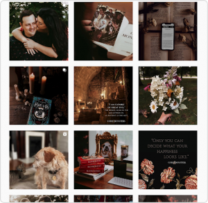
1. Rifle Paper Co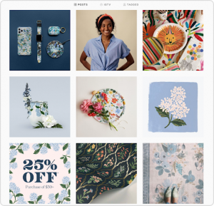
The Rifle Paper Co Instagram grid has an incredible grid. All pictures are taken from afar (none of them is extremely focused) so there's uniformity in the overall view. Plus, there's a floral element in each picture – furthering consistency and showcasing the brand's personality.
2. Project 7
Project 7's Instagram has a very visually well-done account that follows a strict color theme – popping, bold colors. Their theme is bright on the whole as that's the kind of impression they want to leave on their visitors. Another small detail that's hard not to notice: Stories Highlights share the same color.
3. Mindful Words Illustrator
Next up is Mindful Words Illustrator . The grid shows that it's based on a consistent font style. On top of that, there are a lot of colors, making it a lively, bright feed. However, they're all arranged by the squares layout view. This is why each post shares at least one color from the previous post.
4. WorkParty

WorkParty is the exact opposite though as its brand colors are limited to shades of pink. It's why each post has a selected pink shade that falls within their brand's color palette.
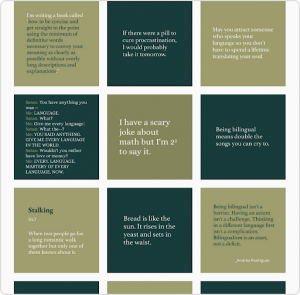
5. The Mind Geek
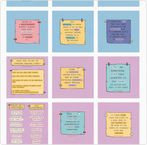
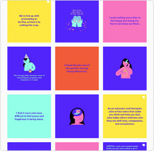
This one's another good example of an Instagram grid layout done well – without even relying on sharing photos. The Mind Geek follows a theme based on sticky notes that share an important message. Plus, the grid uses color combinations for further consistency with 3-6 tiles showing the same color than taking a rainbow approach as the base color of the post changes.
6. Headspace
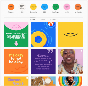
Like the Biteable example shared above, Headspace's Instagram is another example of an on-brand account. If you've ever followed them on Twitter, visited their site or app, or checked out their guide to meditation on Netflix, you'll see each place follows a bright color theme and a particular font. In fact, their brand colors are all lined up in their Stories Highlights too.
7. Shelby Mahurin
This author account has a dark theme, possibly because it uses the same preset over all the pictures to create a uniform grid view.
8. 8fact 
One look at 8fact's account and you can tell they've intelligently executed a consistent grid. How? By using the same template. This means each time their followers see their post, they can instantly tell it comes from their brand.
The much-needed break in the uniformity comes from the background picture and its exposed corner. But those too are on-brand as they're all dark-themed pictures sharing white, black, and gray as their theme colors.
9. The Language Nerd
The Language Nerd also creates a memorable grid view on their Instagram account by alternating between two shades of green backgrounds, their brand colors. At the same time, they use the same font, keeping up with their branding here as well.
10. Career Contessa
Again, in Career Contessa's Instagram grid view too, you can see that all posts are designed using their brand colors. They've clearly taken into account their content strategy for Instagram to design engaging posts.
11. Kerby Rosanes
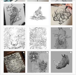
Last on this list is illustrator Kerby Rosanes's Instagram grid layout. It follows the same colour theme, content type (mostly), filter, and the way the pictures are taken. Pictures either show the illustrator's hand at work, the wooden background or capture the full illustration only, therefore, creating an attractive and consistent grid view.
The emerging trend of Instagram grid layout design 2021 and beyond
Before we wrap this up, it's essential we leave you with a future trend in an Instagram grid layout: video reels. Bite-sized video is all the rage lately. So you can expect the video grid for Instagram to pop up regularly in people's IG profiles.
If you're a regular Reels creator, you'll want to identify a sequence or recurring pattern for adding the videos to your grid layout and post content accordingly. This way, you can set audience expectations while creating a visually engaging account layout.
Summing up
To recap, you need an Instagram grid to showcase your brand personality and narrate your story visually as best as you can. For this, put your thinking cap on and figure out your brand colours and fonts, the theme you want to follow, and the impression you want to leave on your visitors. All the better if you've already done this groundwork with a documented brand visual identity guide.
Then, pick any of the nine Instagram grid ideas we shared with you. Select one based on the ease with which you can follow it. Don't forget to preview your grid layout view before you start publishing it.
Source: https://blog.contentstudio.io/instagram-grid/